
How to find and fix the six most common accessibility problems on product pages
What each problem means, how to check your own store, and what to change.
About this guide
The State of Ecommerce Accessibility 2026 tested 59,400 Shopify and WooCommerce product pages. The same six problems appeared more often than anything else.
This guide turns those audit results into a practical list. Start with the problem found on your product page, understand what it means for your customers, then decide whether it belongs with you, your content team, or the people responsible for your theme and apps.
Shopify and WooCommerce both provide a strong foundation. Product pages also contain themes, apps, plugins, custom development, and store content. That is why the fix may sit in more than one place. For the platform-specific context, read where Shopify's accessible checkout ends and the product page begins .
-
1. Make text easier to read
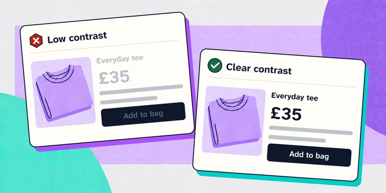
Text needs to stand out clearly from the colour or image behind it. Pale body copy, muted prices, sale labels, placeholder text, and buttons using brand colours are common places for contrast to fall short.
Low contrast makes product information harder to read for customers with low vision or colour vision differences. It can also affect anyone using a phone in bright light or looking at a poor-quality screen.
How to check it: Put the text colour and background colour into the free colour contrast checker Opens in a new window . Then, when you want to dig deeper, this guide to colour contrast ratios explains what the result means and why 4.5:1 matters. Check ordinary text, prices, buttons, links, form labels, error messages, and every interactive state.
What to change: Adjust the text colour, background colour, or both until the combination passes. Start with your theme colour settings, because one change can improve the same element across every product page. Text placed over photography may need a solid background, a stronger overlay, or a different position so it remains readable on every image.
Who normally handles this: Store owners or designers can often fix theme colours. Hard-coded colours and text over images often need a theme developer.
-
2. Give every link a useful name
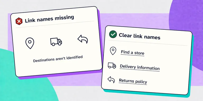
Every link needs a name that can be understood by assistive technology. A shopping bag icon may be obvious visually, but without an accessible name a screen reader may announce only “link”. Linked images can have the same problem when their alternative text is missing.
Product pages often contain icon links for wishlists, account areas, social sharing, image galleries, and baskets. If their purpose is not available as text, some customers cannot tell where they lead.
How to check it: In PageSpeed Insights, look for “Links do not have a discernible name”. Also check every link that contains only an icon or image. Its purpose should still be clear when the graphic is removed from consideration.
What to change: Use clear visible link text wherever it fits the design. For icon-only links, provide a concise accessible name such as “View basket” or “Save to favourites”. Describe the destination or action, not the icon itself.
Who normally handles this: Store owners can improve editorial link text. Missing names on icon and image links usually belong with the theme or app developer.
-
3. Keep headings in a logical order
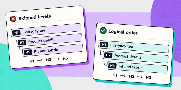
Headings provide a map of the page. Customers can scan them visually, while screen reader users can move directly between headings to find product details, delivery information, reviews, and related products.
A page becomes harder to understand when heading levels jump around. For example, moving from the product title straight to a deeply nested heading suggests that important sections are missing, even when the visual design looks correct.
How to check it: In PageSpeed Insights, look for “Heading elements are not in a sequentially-descending order”, and then read just the headings on your page. They should form a useful outline of the product page without relying on font size or colour.
What to change: Keep the product title as the main heading, use second-level headings for the major sections beneath it, and third-level headings for sections inside those. Change the CSS when a heading needs a different appearance rather than choosing a heading level for its visual size.
Who normally handles this: Theme developers should fix the product template. Content teams should keep the same hierarchy inside product descriptions and editorial content.
-
4. Make tap targets easier to select
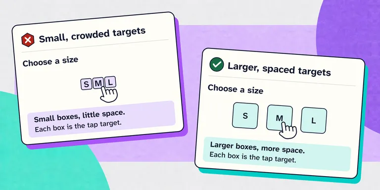
A tap target is the clickable area of a button or link. Product galleries, quantity controls, colour swatches, carousel dots, close buttons, and tightly packed footer links often leave very little room for an accurate tap.
Small or crowded controls create mistakes for anyone using a touchscreen. They are particularly difficult for customers with limited dexterity, tremors, larger fingers, or a device moving on public transport.
How to check it: Use the product page on a phone and deliberately work through every control. In PageSpeed Insights, look for “Touch targets do not have sufficient size or spacing”. Pay attention to controls that are visually small but used repeatedly.
What to change: Increase the clickable area, not only the icon inside it. Add space between neighbouring controls and make the entire visible control respond to a tap. The layout should remain comfortable at mobile widths and when the page is zoomed.
Who normally handles this: Designers can set the target size and spacing. Theme or app developers need to make sure the actual interactive element fills that area.
-
5. Make control names match their visible labels
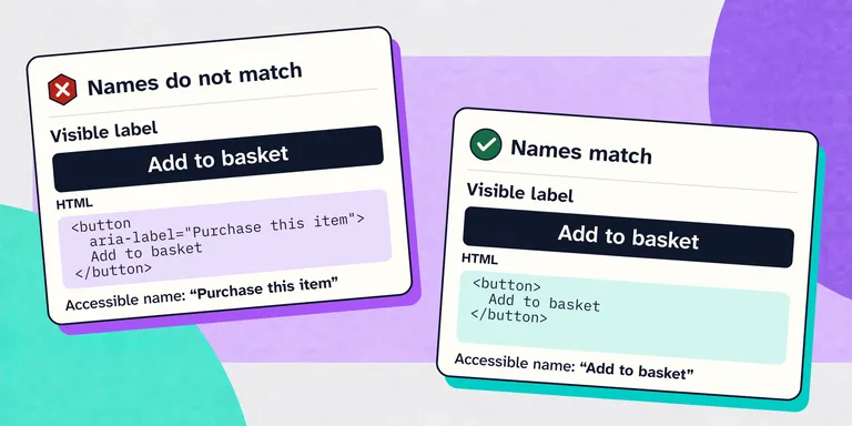
A button can visibly say “Add to basket” while the code gives assistive technology a different name, such as “Purchase this item”. Both names sound reasonable, but the mismatch creates a real interaction problem.
Customers using voice control often activate a button by saying the words they can see. If the name in the code is different, “Click Add to basket” may do nothing even though the control is directly in front of them.
How to check it: If an audit reports a label and name mismatch, compare the visible wording with the accessible name shown in the browser's accessibility tree. A practical manual check is to use voice control and speak the exact words shown on the control.
What to change: Use the visible text as the accessible name whenever possible. If extra context is genuinely needed, keep the complete visible phrase at the beginning. “Add to basket, navy jacket” works; replacing it with “Purchase this item” does not.
Who normally handles this: This is usually introduced by a theme, app, or custom component and should go to the developer responsible for that control.
-
6. Add useful alternative text to images
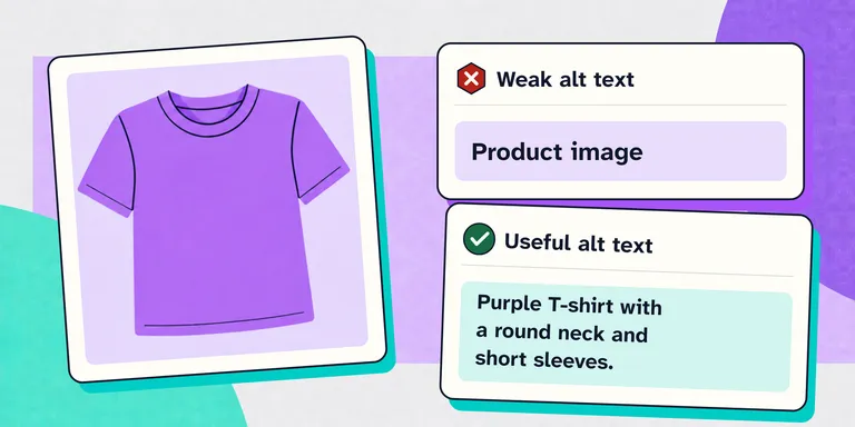
Product images carry buying information: colour, texture, fit, scale, finish, and details that may not appear anywhere else. Alternative text makes the relevant information available when the image cannot be seen.
Missing alternative text may leave a screen reader user hearing only “image” or, even worse, the image filename. Repeating the product name on every image technically provides text, but still removes the differences between the front, back, detail, and lifestyle views.
How to check it: PageSpeed Insights and other automated scanning tools can find images with no
altattribute, but whenalttext does exist they can't decide whether the words you've used are useful. Review the text without looking at the image and ask whether it provides information that helps someone understand the product you're selling.What to change: Describe what matters in the context of that image. The complete guide to writing product image alt text shows how to write it, and a real product-page example shows what useful alternative text sounds like. Keep decorative images silent, but do not treat product photography as decoration. Build alternative text into the product publishing process rather than adding it as a clean-up task later.
Who normally handles this: Product and content teams should write the descriptions. A developer is needed when the text exists in Shopify or WooCommerce but the theme does not output it.
Other product page checks worth doing:
The six findings above are the most frequent automated results in this year's dataset. A usable product page also depends on interactions that need more than an automated scan.
- Forms and subscription choices: watch how clear labels and real form controls improve a subscription page .
- Keyboard focus: check whether focus stays visible and moves into drawers and dialogs. See what happens when a cart drawer opens without moving focus.
- Product options: test every size, colour, quantity, and subscription option without a mouse. See why custom product options often break.
- Custom dropdowns: confirm that customers can open, understand, change, and close them with a keyboard. Follow the practical dropdown check.