
WCAG Colour Contrast: What does the 4.5:1 ratio actually mean?
20 min readAnyone who has worked with web accessibility will likely be familiar with the WCAG Colour Contrast Requirements. At Level AA, most text and images of text need a contrast ratio of at least 4.5:1. Large text needs at least 3:1.
But have you ever wondered what that 4.5:1 ratio actually means?
This article explains where the contrast ratio comes from, how it’s calculated, and why it improves readability in real-world conditions.
First, what exactly is colour contrast?
Colour contrast refers to the perceptible difference between text and its background. This contrast is crucial for readability, especially for people with vision impairments. It plays a key role in how easily users can engage with your content.
So what does 4.5:1 actually describe? In plain terms, it’s the difference in brightness between your text and its background - and the bigger that gap, the easier the text is to read. It isn’t a number someone picked at random. It is designed to keep text readable for more people, including people with low vision or reduced contrast sensitivity. The reason for the 4.5 figure becomes clearer further down.
Different types of colour vision
Not everyone sees colour the same way, and that matters a great deal when it comes to contrast. Colour blindness, or Colour Vision Deficiency (CVD), affects roughly 1 in 12 men and 1 in 200 women. Usually it’s a milder form, where one type of colour-sensing cone is weakened rather than missing entirely (a reduced sensitivity to green, called deuteranomaly, is the most common of all). The three main types, shown below at their strongest, are:
- Protanopia: difficulty distinguishing red and green, with reds also looking darker
- Deuteranopia: similar difficulty distinguishing red and green, but without reds looking darker
- Tritanopia: difficulty distinguishing several blue, green, yellow and red combinations, and much rarer than the other two
Below is an interactive demonstration, using a photo from Magda Ehlers on Pexels, that shows how people with different types of colour vision perceive the same colour spectrum.
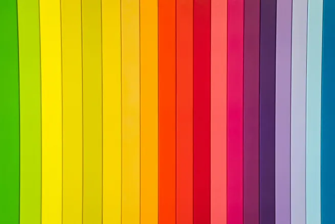
You might notice that there’s not much difference between protanopia and deuteranopia in the demonstration above. This isn’t a mistake. Both affect red-green colour discrimination, so the simulations can look similar. Protanopia also tends to make reds appear darker.
Tritanopia affects blue-yellow colour discrimination, so its simulation produces a noticeably different shift across blues, greens, yellows and reds.
This visualisation helps explain why colour alone should never be used to convey information - what might be an obvious colour difference to someone with typical colour vision could be indistinguishable to someone with CVD. That’s actually its own WCAG rule, SC 1.4.1 Use of Color (Level A), and it’s separate from contrast: it’s about never relying on hue alone, like error text that’s only red, or links set apart from body text by colour with no underline. This is why maintaining proper contrast ratios is crucial for accessibility, regardless of how users perceive colour.
What the heck is relative luminance?
Relative luminance is a measure of the relative brightness of a colour, normalised from 0 (black) to 1 (white). It does not mean the web colour itself gives off light. It’s worked out from the red, green and blue values that make up a colour, but the three don’t count equally: green contributes around 72%, red about 21%, and blue about 7%.
This helps explain why some colour combinations are easier to read than others. It’s also why pure blue (0,0,255) looks so much darker than pure green (0,255,0) to our eyes, even though both are cranked up to maximum: green pulls most of the weight, blue barely any. A dramatic difference in luminance.
So how is the ratio worked out?
If you like the specifics, the formula is (L1 + 0.05) / (L2 + 0.05) - the lighter colour’s luminance over the darker one’s, with a small +0.05 added to each to allow for screen glare. That little offset is why the scale caps at 21:1 for black on white rather than shooting off to infinity, and it’s also why 4.5:1 doesn’t mean your text is literally four and a half times brighter.
You’ll rarely do this by hand, mind you. But it’s a genuinely useful thing to know that mid-grey #767676 on white lands almost exactly on 4.5:1, which makes it about the lightest grey you can safely use for body text on a white background. Nudge it any lighter and it starts to fail.
Who decided that a 4.5:1 or 3:1 ratio was needed?
The numbers aren’t plucked from thin air, and the reasoning behind them is actually quite neat. The 3:1 baseline comes from older display standards: the minimum sensible contrast for someone with typical vision. The 4.5:1 figure builds on that. People with moderately reduced vision (around 20/40) lose roughly a third of their contrast sensitivity, so the baseline was bumped up by half again to make up the difference. 3 times 1.5 is 4.5. The same reasoning gives the stricter AAA level its 7:1, designed for greater loss of contrast sensitivity.
And bear in mind that colour contrast doesn’t just matter to people with poor eyesight. Most people have struggled to read faint text in bright sunlight, on a poor-quality screen, or in a badly designed interface. The WCAG ratio is a strong baseline, and aiming above it improves readability in more situations.
Why these numbers matter in practice
Understanding the science behind contrast ratios, relative luminance, and colour vision deficiencies might seem academic, but it all comes together in practical application:
- Different cone cells interpret colours (as shown in the colour blindness demonstration)
- Relative luminance affects perceived brightness (like why blue appears darker than green)
- Contrast ratios ensure readability (the 4.5:1 standard)
Together, these lead to better design decisions that work for more people. Two colours can meet a light-dark contrast ratio while still being difficult to distinguish by hue alone, which is why colour contrast and use of colour are separate requirements. And subtle grey text that looks “sleek” on your monitor often becomes difficult to read on a phone in sunlight.
WCAG contrast ratios are not arbitrary numbers. They provide a practical baseline for readable text, while good design can go further when the typeface, screen or viewing conditions demand it.
Tools for checking colour contrast
Getting colour contrast right takes a little care, but it pays off. Low-contrast text was found on a remarkable 83.9% of the top one million home pages (WebAIM Million, 2026), making it the most common accessibility problem on the web. It’s almost as common on ecommerce product pages: colour contrast failed on 80% of the 59,400 tested for the State of Ecommerce Accessibility 2026. Happily, it’s also one of the easiest to put right.
My go-to tool is the fantastically designed colourcontrast.cc. There are loads of tools which do this, but I love the design of this one and there’s zero room for ambiguity. If you’d rather not leave the browser, Chrome and Edge DevTools show the contrast ratio right in the colour picker, with a pass/fail against AA and AAA and a “suggested colour” fix.
The short version
When you’re checking your own designs:
- Aim for 4.5:1 on body text and 3:1 on large text.
- Don’t forget the other states: hover, focus, and placeholder text (placeholder still needs 4.5:1).
- Remember contrast isn’t only about text: visual information needed to identify controls and their states, including essential borders, icons and focus indicators, needs 3:1 too (SC 1.4.11).
- Never rely on colour alone to convey meaning (SC 1.4.1).
- Run anything questionable through a contrast tool before you ship, and try a CVD simulator for colour-coded interfaces.
Get the contrast right and you’re not just ticking a box for compliance: you’re making your content readable for more people, across more screens and lighting conditions.